Designers Rethink Website Layouts Beyond 12 Columns
Designers are moving beyond traditional 12-column grids to create more unique and effective website layouts, according to CSS-Tricks. This shift allows for more creative freedom and better communication of a company's personality and message.
Original reporting · css-tricks.com
Original: “Beyond 12 Columns: Designing Layouts With Personality”
Read “Beyond 12 Columns: Designing Layouts With Personality” at CSS-Tricks →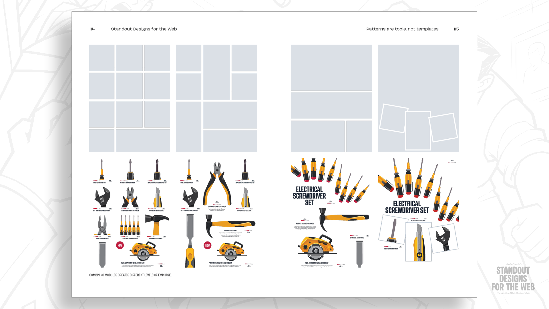
How this was written. GDS wrote this article with a language model from CSS-Tricks’s reporting (model: @cf/meta/llama-3.3-70b-instruct-fp8-fast); it describes that reporting rather than adding to it. The original, linked above, is the full story.
Key points from CSS-Tricks’s report
- Designers are moving beyond traditional 12-column grids to create more unique and effective website layouts.
- Understanding a company's personality and needs is crucial when designing a website.
- Using a modular grid can add another dimension to a layout and open up more creative possibilities.
- Starting with content and considering how elements relate can result in more unique and effective layouts.
- CSS Grid has changed what is possible for page layouts, but designers should still consider the unique needs and personality of a company when designing a website.
Designing websites has come a long way since the early days of HTML tables and spacer GIFs, according to CSS-Tricks. The introduction of CSS frameworks and grid systems made layout planning and implementation easier, but also led to the widespread adoption of 12-column grids as a standard convention.
The use of 12-column grids was popularized by frameworks like Blueprint CSS and the 960 Grid System, which offered ready-made grid systems for designers and developers. However, this has resulted in many websites having similar layouts, with designers often reaching for a familiar solution without considering the unique needs and personality of the company they are designing for.
CSS Grid has changed what is possible for page layouts, but many designers still start by dividing a page into 12 equal columns and then deciding how to fit their content into them. This approach can lead to generic and unremarkable designs, rather than unique and effective layouts that communicate a company's message and personality.
To create more effective layouts, designers should start by understanding the company they are designing for, including what makes it different from its competitors and what it wants people to remember. This involves considering the company's story, personality, and values, and how these can be reflected in the website's design.
A fictional company called Wheelman is used as an example to demonstrate the importance of considering a company's personality and needs when designing a website. Wheelman provides products and services for getaway drivers and has a rebellious and fun personality, which should be reflected in its website design. By starting with content and considering how elements relate, rather than relying on a standard 12-column grid, designers can create more unique and effective layouts.
Using a modular grid, which combines rows and columns to create rectangular or square units called modules, can add another dimension to a layout and open up more creative possibilities. This approach allows designers to establish hierarchy, control whitespace, and add variety to a composition, resulting in a more unique and effective design.
By moving beyond traditional 12-column grids and considering the unique needs and personality of a company, designers can create website layouts that are more effective, unique, and memorable. This approach requires a deeper understanding of the company and its goals, as well as a willingness to experiment and try new things.
CSS-Tricks reported that pre-orders for the book Standout Designs for the Web are now open, which provides more information on designing layouts with personality.
Questions and answers
What is the problem with using 12-column grids?
The problem is not the 12-column grid itself, but rather reaching for a familiar solution before considering what makes the company distinctive and what its website needs to communicate.
How can designers create more unique and effective layouts?
Designers can create more unique and effective layouts by starting with content, considering how elements relate, and using a modular grid to add another dimension to the layout.
What is the benefit of using a modular grid?
Using a modular grid can establish hierarchy, control whitespace, and add variety to a composition, resulting in a more unique and effective design.